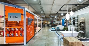


Intended to help move the bank's refreshed customer experience forward and reflect its commitment to innovation, the new-look branches are radical, revolutionary and push the boundaries of conventional banking design.

"Branches are often relegated to the banking hall of a mall. We wanted to develop a branch that would stand up against retail as a category and create a space that would interest and intrigue people. The bank has shifted its focus to be more innovative, more forward thinking and needed a space that expressed these intentions. So we needed to distil a space and an attitude that would act as a visual anchor for this thinking while at the same time remain both a catalyst and constant reminder of the spirit of invention and innovation within Standard Bank," explains Callie van der Merwe, Design Partnership CEO.
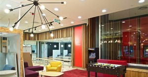
To inform its design, the team spent months physically working the floor, trying to understand the needs customers faced when in the bank. What they realised was that the branches comprised a series of spaces that firstly needed to be easily identified so customers knew where to go and secondly, that facilitated a handful of basic activities - mostly people having, or waiting to have, conversations.
"We tried to create an intuitive space that would enforce layout principles and drive the new customer experience. Most often, the first conversation you have in the bank is at the help desk, so we started there. Our Hello Desk is well signposted, easy to spot and located right in the front of the branch, so it is naturally the first place you stop. Unlike other help desks that only face outwards and run the risk of a service breakdown from not being able to see what's happening to the customers behind them, we turned our desk 90 degrees so there's always someone watching the customers."
Next, the team tackled the Service Bar. The long-term goal here was to consolidate all queries and enquires to this one counter to eliminate the possibility of queuing in the wrong place and dramatically reduce the time to service. This design took its cue from studies by international banks, which showed that single queues were far more effective.
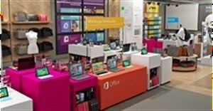
Following this area, the team turned its attention to the Self-Service Lounge, which combines waiting with the option to 'help yourself' to maximise space and atmosphere. "The wild idea here was that these lounges could one day become mini outlets of their own. Therefore, they house all the new technology tools one uses for self-service banking, such as tablets for mobile banking and internet banking. A permanent staff member is stationed here to help waiting customers get to grips with the new self-service tools and experience the new ways of banking."
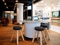
In terms of nurturing those different 'conversations' that take place in the bank, the team focused heavily on addressing seating in the branch. Drawing on its hospitality and retail experience that shows that comfortable booths are the most popular seats at any restaurant in South Africa, the team introduced these in all the sit-down chat spaces. In addition, long benches that act as queue dividers and that people could move along while in the queue were brought in and stools added to the standing counters so customers with long enquiries could do these while seated.
The tellers and ATMs have been left unchanged for now due to security and safety requirements, although new cash recyclers will be tried out in branches next year to improve the transactional experience. Visually, these elements were refreshed to tie in with the rest of the branch.
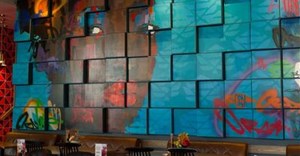
The visual language of the makeover was vitally important, and part of the core design brief. "One of the key requirements was to create 'conversation capital'; a visual reference that would do the one thing that banks traditionally have never done, which is appeal to all ages, profiles and personalities. So in other words, create a visual bank representation that would be extremely strong in breaking perceptions of what a bank conventionally looked like (or perhaps even, should look like) but without polarising opinions."
Central to this was the idea of moving the brand beyond its blue wrapper to demonstrate its new way of thinking. While the bank has always been the blue bank and this will not change, the design called for sparing use of this trademark colour.
"We wanted customers to recognise the brand, but we also wanted them to stop and look twice; interrupt their normal pattern. Too much blue and the shift that we needed would not be evident. Too little blue and people might miss it. Blue has been used as the call out on the signage, the shop front and the blue wall of the ATMs. This is how you recognise the bank. However, once inside, customers did not need to be reminded that they were in Standard Bank. Here we wanted to show them something different. We chose clues and archetypes, colours and finishing palettes that were tranquil, calm and considered - all the things that a good conversation about your finances should be...not just blue."
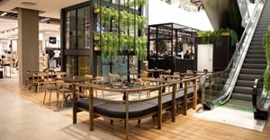
The 'call out' function was also a critical shift; to this end, the shop front has been opened up as much as possible to make the bank more inviting and accessible. The security elements are contained and secure enough to allow the conversation to be less intimidating and more akin to a positive retail experience.
The new branch design is fresh, compelling and cutting-edge, but running through every element is a space that accommodates the human factor.
"While we can't predict where banking will go and what advances will occur, we do know that every development will need to consider the human factor. That ultimately, banking will always be about translating wealth from the real to the virtual so that we can exchange it for something real again - and that is something that only real, in-the-flesh people can do. This design can evolve with new technological advances, but it will always have a space for the human factor. Because branch design is not about automation - people do not want to interact with a screen at a branch - we all carry screens in our pockets and can do that at any time - they want to interact with people. Yes, banking services should become easier, more mobile and seamless, but banking branches offer a human element when the mobile and automated have failed."
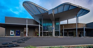
All prominent bank sites will be completely overhauled in line with the new design, following which smaller sites will be revamped to feature key elements of the design. To date, Bedfordview, Woodlands and Alice Lane have been overhauled, with another eight strategic stores earmarked for renovation before the end of the year.