They were words I did not want to hear, as I knew what they meant and how I felt and would respond to them. Those words were powerful; it felt as if they had taken on a visual form in the way they broke me down. Being young, this seemed like the end of my small world. But as I look back, married to the woman who said those words, and with two children, I know it was necessary for me to feel what I felt that day.
It led me to a place where I know the importance of words and the impact of how they are communicated, not just as words but as visual communicators of meaning and intent.
So what allows us to feel the meaning of words? I guess, for myself, it comes down to tone. For example, the words of a genuinely emotional song, there is an intent to convey an emotion, but it lies in the hands of the artist to sing with a fitting tone for the audience to connect with the song.
So what happens when you don't have an audible tone? How would one give context to the tone of words in a sentence? Enter typography and its unique and significant role.
The way in which letterforms are crafted and arranged on a page is our vehicle in the communication of tone and intent. I often see this lost over email and text messages or maybe even this article, purely because of the lack of distinctive typeface choices within digital and online media.
I suppose email and text message communication are excusable as there are multiple reasons for miscommunication of tone on these platforms; lack of typefaces, lack of time and sometimes the lack of importance of what's said. But as visual communicators, we are without excuse as our work enters into mass media channels. Our work should be as alluring as our first crush, and we should communicate as if we were speaking to each other for the first time.
Imagine it; we hang onto every word, and our attention drifts away from the world around us, their words have a soul and stay with us for a lifetime. But it feels to me that the work in mass media markets has made typography look like it has lost its soul. There is a lack of tone and character expressing what is being said, and I would go as far to say that the audience sees it for what it is, bland and uninspiring, with no reason or appeal for them to respond. So why are creatives doing this to the audience their clients are trying to communicate and form relationships with? Yes, there is great work out there with fantastic ideas and large amounts of time spent in choosing what to communicate and how this message is presented, but far too often this does not happen. I would even blame myself for being part of this problem: daily we are crunched for time and default to the hipster typeface, or the clean san serif. And on the flip side, we're forced to use a brand's font over and over, until headlines eventually look like a forest of bland letterforms planted next to each other.
So when or why should we change this designer reflex or default behaviour? When we get more time allocation to projects, when our clients gain more understanding of typefaces, or when we finally decide to pick up our designer soul and fight for the use or crafting of original and attention grabbing lettering and typefaces.
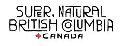
I recently came across a project that was sent to me by a friend, which showed me that there are still some people who are fighting this battle within the mass media. The project was for "Super Natural British Columbia." It is amazing; a complete brand typeface has been crafted with thought and conveys a feeling of the outdoors. Even with its multiple uses as a brand font it is anything but generic. In every execution, it has enough variation to make it stand out and draw attention. This is what I want to see more of, work that is beautiful and speaks the right language in a tone that an audience can connect with.
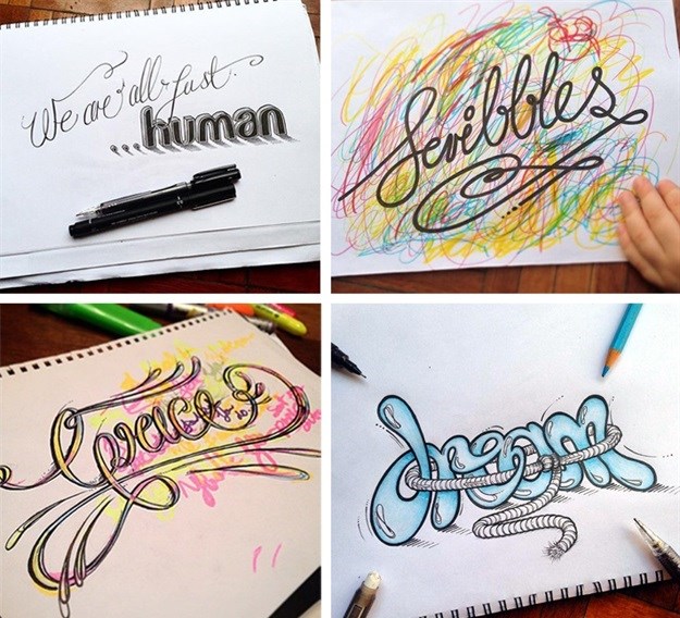
What I find interesting is that you find even better and carefully thought-out handcrafted typographic work strewn across social media, communicating personal and inspiring words, through the most delicately subtle or technically detailed construction of letterforms. It is as if we are generic pop artists by day and take on the persona of a poetic spoken-word artist by night. This proves that as visual and typographic communicators we want to be doing work which speaks volumes. We want to create work which looks and sounds authentically great! To communicate a feeling where people react and are naturally led to give commentary. Is it not high time we fight to merge the two? Time to bring our evening romance with beautiful, freehand lettering into a marriage with our daytime flirtation with the rigid and sometimes generic san serif. Maybe even court a little and see where the relationship goes. Hopefully, this will lead to seeing more typographic work in the mass media which has the right intent and tone to move the viewers to smile, laugh, cringe and cry purely from the use of a well-thought grouping of letters. I know I'm feeling motivated to test the waters a little...