We asked Conway-Cleaves to share her journey with the annual, her inspiration and what she has learnt along the way.
I first worked on Brands & Branding in my internship year at Boomtown. I had been working with Boomtown for a few months and was thrilled at the opportunity to work on a project with such an open design brief. I thoroughly enjoyed the process of concepting ideas around a given theme and exploring how the idea would translate visually into the design.
Boomtown typically briefs two designers to generate individual concepts and creative expressions aligned with the designated theme. These concepts, along with cover possibilities, are presented to the client, and the final design brief is carried out by the designer whose idea is selected. This is the process through which I came to design Brands & Branding in 2021. In 2022, I was directly asked to create the publication based on the success of the previous edition. This year, in 2023, we once again followed the usual process.
Each year, Boomtown is tasked with developing a concept and an overall look and feel for Brands & Branding based on the annual theme given to us by the client. The brief involves bringing this concept to life through visuals and typography that seamlessly weave through the publication, from the cover to the contents, introduction, theme, and divider pages. This approach aims to craft a strong conceptual piece of work that speaks to the industry through the chosen theme.
In 2021, we were given the theme of ‘resilience’, particularly in the context of businesses adapting to the challenges of the Covid-19 pandemic. I drew inspiration from the phenomenon of ‘typoglycemia’, which is a fascinating discovery regarding the cognitive processes involved in reading text. This demonstrates that readers can comprehend text even when it contains spelling errors and misplaced letters.
Our creative expression of this concept came to life in the headings of the publication, where we intentionally manipulated letters. This showcased the remarkable resilience of the human mind – the capacity to not only overcome but also adapt in the face of unforeseen challenges.
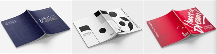
In 2022, the theme was ‘Print versus Digital Media’. I explored the often-perceived rivalry between these two mediums while highlighting their potential when used together. This gave rise to our concept ‘The Synergy of Print and Digital Media’. To visually convey this idea, we used contrasting elements to symbolise each medium. Solid, bold shapes represented print media, while intricate lines composed of binary symbolised digital. These contrasting elements were merged to create compositions that visually communicated the beauty of their coexistence and revealed objects such as the nib of a fountain pen and a sleek cell phone to further enhance our concept.
The concept truly came to life on the cover through a QR code that, when scanned with a phone, beautifully animated the elements on the cover. This ultimately showcased the synergy of print and digital media in action.
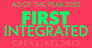
This year, we were asked to explore the theme of ‘Artificial Intelligence’, which is a prominent topic in our industry today. Our inspiration came from the discovery that Martin Luther King Jr improvised his iconic speech, with the famous phrase 'I have a dream' never originally appearing in his prepared notes. Sensing the palpable energy of the crowd, he instinctively deviated from his scripted conclusion to share his heartfelt vision for the people in his country. We recognised that no matter how advanced AI becomes, it will never be able to replicate what King did in that moment – follow his human instinct. This insight inspired our theme ‘AI vs. Human Instinct’.
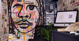
Throughout the pages of the publication, we tell similar stories of these pivotal moments where individuals, in the face of resistance, trusted their instincts and changed history. Visually, we showed this by creating the publication with a distinct human touch. We achieved this through raw, handwritten typography, evocative textures, and pen illustrations. These elements evoke a sense of urgency and authenticity, as if these profound moments were hastily jotted down in the heat of inspiration. Our hope is that this edition of Brands & Branding is a reminder to those in various industries who may fear the advancements of AI that our humanness will always be needed and essential to uncovering great insights.
My three-year involvement in this project has taught me the importance of continuously digging deeper. This entails going beyond the surface and digging deeper to create stronger concepts and executing them visually through typography, colour, texture, and more. I learned that I not only loved design but the conceptual thinking that goes into creating a great design and idea.
Having worked on three consecutive editions, it is interesting seeing them side by side, as I can visibly see my growth as a designer from the 26th to the 27th edition, and I can see the wide range of styles I have been able to explore. This year's 28th edition is vastly different from last year’s 27th edition. The previous publication was very structured and clean with a classical feel, using predominantly black and white. In contrast, this year's edition is extremely loose, making use of textures, bright colours, handwritten typography and illustration.
While I am the sole designer, I am guided by the insights of incredible creatives. Jesse Sharkie, the design director at Boomtown, plays a significant role by providing valuable design input and collaborating closely with me to ensure that we visually create the right feeling to effectively convey the concept. Ahmed Tilly, an ECD consultant, has helped strengthen our concepts, offering valuable insights and guidance.
Caitlin Morgan, copywriter, and Saskia Smith, intern copywriter, have both contributed their skills to Brands & Branding, helping us beautifully articulate our ideas. Lastly, Anina Pienaar, group account director, works together with the client and ensures that we have the time needed to explore ideas and execute our work effectively. I consider myself privileged to work alongside such a talented group of creatives at Boomtown.