But you have to appreciate the exceptional idea behind this century old logo, that came to symbolise the transformation of the music industry to a mass consumer market.
After learning of the recent demise of the HMV Group (it's been placed under administration as of 15 January this year), I was inspired to tell the story of the brand's logo. The His Master's Voice's or HMV logo has become an entrenched, if discreet symbol that has given rise to innumerable cultural, political and social references.
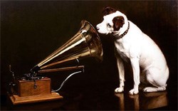
At first glance, a pet listening to a recording of his owner's voice. A charmingly personable and immediate concept. But the whole story behind this logo is much more interesting.
Interesting enough in fact to contain a much deeper, much more meaningful and by implication more human significance. No wonder it survived for more than a hundred years.
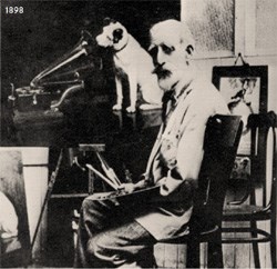
It started off as a painting by a an English artist by the name of Francis Barraud. Barraud came into possession of the dog when his brother, the original owner, died.
Sadly we know little about the dog, other than it's name, which was "Nipper". Probably a biter. And, that it mourned it's deceased owner terribly. To be consoled only by listening to a recording which Barraud had made earlier of one of his brother's sermons.
How do you improve on that, as an idea to represent the attributes of what a sound recording brand should be? Nothing less than invoking a voice from the beyond. Presented as an immediate, universally comprehensible, approachable, memorable and above all meaningful symbol. Staggering.
In 1902 Barraud sold the painting to the Victor Talking Machine Company, who promptly registered it as their trademark. The strength of the layered meaning, both obvious and complex simultaneously, has persevered through two world wars and more than a century of market fluctuations. In addition to this, it has become a frequent political and cultural metaphor often denoting implied subservience, delegation, or asymmetrical power relationships.
It's difficult to think of another logo with as strong a relationship between the logotype, or name, and the symbol. Not only does the dog-phonograph symbol explain the name of the brand, the name also perfectly illuminates the significance of the symbol. Without using the words "dog" or "gramophone". Now that's a logo.
Without even saying it, the logo implies that this product
1. reproduces realistic, believable sound, (good enough to fool a dog's hearing)
2. delivers a significantly meaningful emotional experience
The original painting is currently owned by EMI, the successor to the Victor Talking Machine Company. Without question one of the most recognised trademarks in the world, despite it's infrequent depiction.
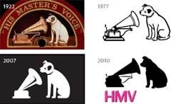
The logo's many evolutionary steps, inherent to a brand identity of this legacy, lead us to the logo's current appearance: abbreviated and very magenta. Perhaps not it's optimal manifestation, certainly not the most dynamic. But it retained all the nostalgic elements that made up its powerful brand story. And it would surely be missed. Good dog.