Yellowwood gives Cobb a completely new look Client Challenge:
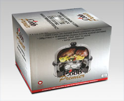
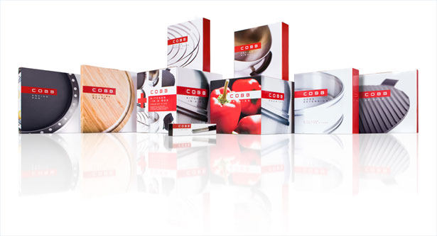
Cobb™ is a locally developed cooking system that has found favour across the globe. Winner of the Vista Design Award, as well as the Spoga+Gafa Innovation Design Award, the Cobb™ is unique in its class. The system is aspirational, engaging and innovative. However, the product packaging left much to be desired and the brand identity was out of step with the contemporary and innovative nature of the product. Yellowwood was thus tasked with repositioning the brand as a whole, but also to refresh the identity and develop a packaging system that could be applied to the complete range of accessories in the Cobb™ offering. Our Approach:"After conducting a complete and thorough competitor analysis, a brand positioning strategy was developed by Yellowwood. This formed the basis for the alignment of the brand to the associations of efficiency and innovation inherent in the product. The brand signature was completely re-designed so as to compete with the most aspirational international design brands. In order to meet the requirements of the brand positioning, a primary packaging system was then developed for both the Cobb Premier™ and Cobb Gas™. This system was implemented across a range of twelve brand extensions across eleven different packaging formats (including the now famous Cobb Kitchen-In-A-Box™). The range features custom photography and a "back-of-pack" translated into six languages," says Richard Stone, Yellowwood's creative director. The Result:The outcome was a world-class product presented in a truly world-class packaging system. It was elegant yet powerful, with a strong and consistent brand language and optimal product differentiation.
<<Back
|